Platform Update - 2026
UX Decluttering
My journey here started with identifying a friction point that felt small on the surface, but revealed deeper usability challenges. What followed was an in-depth exploration of navigation patterns, interaction states, and information hierarchy.
Decluttering Sidenavigation
The journey here started with identifying a friction point that felt small on the surface, but revealed deeper usability challenges. What followed was an in-depth exploration of navigation patterns, interaction states, and information hierarchy."
making it more functional and reducing redundancy so it meets the standards
Platform Update - 2026
Role
👩🏻💻 Lead Designer
Product Status
✅ Launced
Date
🗓️ Jan - Feb

Why is it required?
As the platform evolved, its navigation architecture grew alongside it. What began as a straightforward hierarchy gradually expanded into a complex ecosystem of portfolios, modules, loan-level features, configuration and layered settings. While the functionality increased, discoverability and wayfinding became increasingly challenging, forcing users to navigate through multiple layers before reaching critical tasks.

As the company scaled from 0→1 to 1→10, it became essential to simplify core user experiences. The redesign focused on creating clearer navigation, stronger hierarchy, and more intuitive interactions.


Some screens nomenclature:
Admin Screen -
All companies are listed and managed. Customer Success Managers (CSMs) and Super Users access this area to perform company-level configurations, onboarding activities, and operational actions.
Portfolio Screen -
Inside company <> loan level view, tracking of loan recovery stage. Creating campaign for calling and digital communication channels to run and collect debts.
Loan Details Screen -
It consists of all loan documents, summary and other trackings.
Configuration Screen -
For all variable level settings, permission groups, user creation, handling licenses and payment link configuration, etc.
OBJECTIVE
How do we help users find what they are looking for with the least amount of hassle?

Image: A conceptual process flow mapping a product design methodology from raw data to structural execution.
🔴 PROBLEM
What people think? What's exactly the gap?
~ No search for anything
~ No hierarchy everything seems falloff; no proper positioning.
~ Moving between platform-level, company-level, and module-level settings lacked clear indicators.
~ Navigation depth created friction
~ We have multiple company loan portfolio; identifying which comapny am takes so much effort. I had to hit back to find out.
Sidenav is missing capabilities that are essential to customers' daily work. Where should we start to cover everything?
📒 PHASE 1 - UNDERSTANDING THE SYSTEM
RESEARCH PHASE

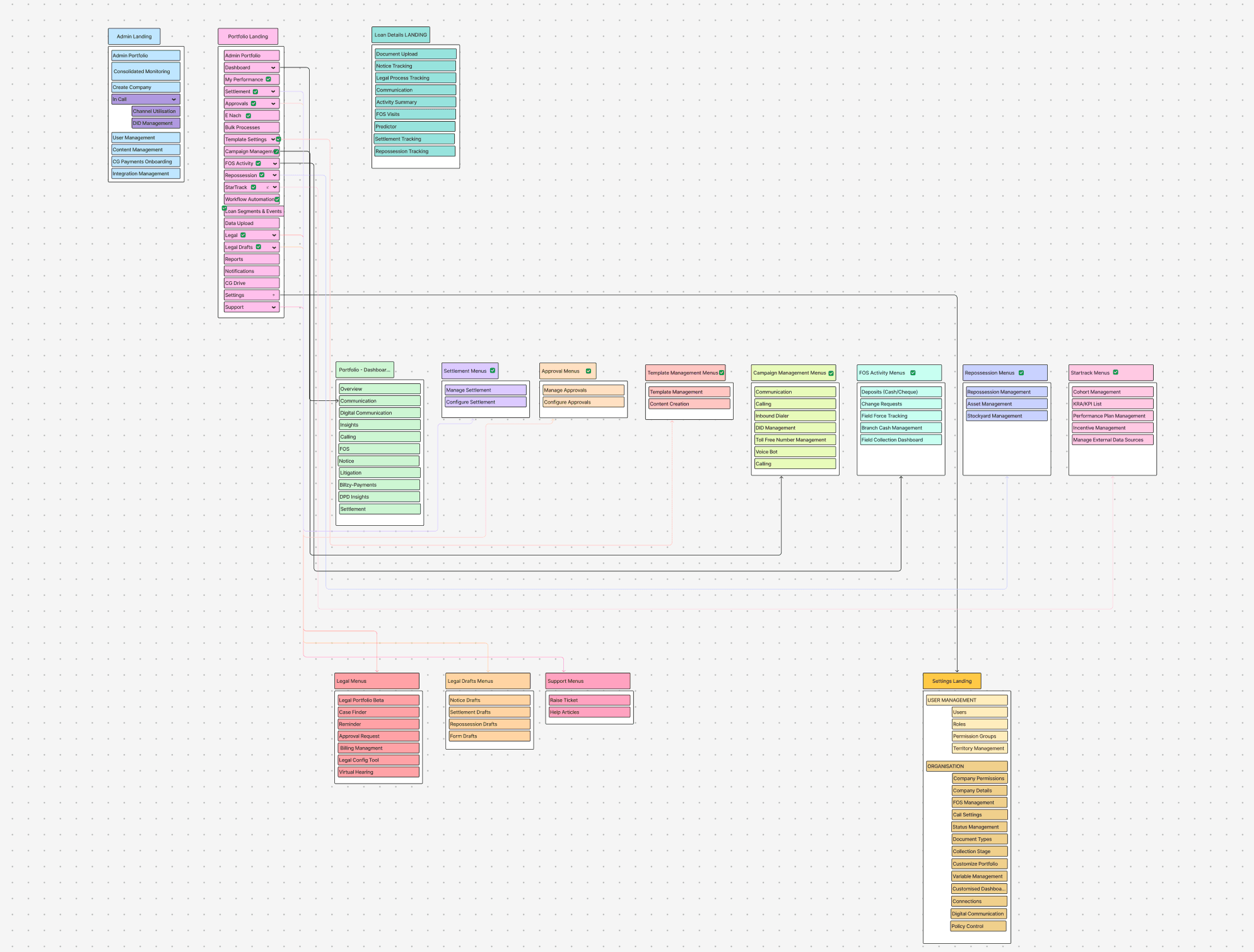

Image: A comprehensive hierarchy map to uncover and understand the depth of the existing navigation structure.

Image: Overview of all pods and their key functionalities across the platform.
~ some of the feedbacks we got from our internal team.
as CSM we had to spend a lot of budget on acquiring employees to serve the client.
~
Customer Success Manager
I could perform my tasks once I found the right screen. Finding that screen was usually the challenge.
~
Sales Executive
The problem wasn't that users couldn't complete their work. The problem was that they had to learn the product's structure before they could do their work."
~
PM POD 1
The platform has a lot of power, but the navigation made it feel more complex than it needed to be.
The information was there, but I had to build a mental map of the product before I could work efficiently
~
Sales Executive
💬 "I often found myself asking, 'Where am I right now?' rather than focusing on the task I was trying to complete."
I always kept asking a colleague, 'Where do I find this again?'"
~
PM POD 2
What's available in the market?
📒 PHASE 2 - DEFINING THE VISION
MARKET PHASE
breaking menu items to module level.

creditnirvana
multi-company access switch & skipping the icon clutter view.

two level navigation bar so scroll is adjusted.

~ Currently, roughly XX% of users coming to Headout use the search feature, and this number decreases significantly as users move between pages.
City page > Collection page (group of all experiences from one point of interest) > Category page > Experience page.
~ More users click on the search result suggestion dropdown compared to the actual search results page.
Start from blank canvas. Our vision?
🧠 PHASE 3 - BRAINSTORMING & DESIGNING
DESIGN PHASE

My Final designs…
1
Grouping action as per Module Services given.
DPD (Days past due) plays a key role on debt recovery stage. So we channeled navigation on basis of services.
Current Admin Screen for Company switch we clubbed under company avatar to builld understandability that all related actions to be found at one place.
Everything on platform is configurable. So menu item/modules is shown on basis of billing.
Combined the Admin Screen to Company Profile so it gets easy switch for it.
2
Search should be directive, than exploratory
Users are more likely to view the modules, or the actions they want to perform without distraction.
3
Taking bigger bets
Reducing decision fatigue by surfacing high-value actions at the point of entry.
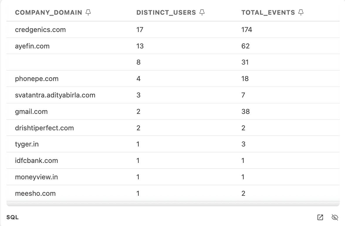
The numbers showed the positive adoption of revamp.
2
the big bets now paying off.
Post-launch, users reported that navigation felt significantly simpler, with search emerging as the strongest-adopted improvement.

I've grown tremendously in the last year, some key achievements of which I have listed below:
Discovery thinking -
Starting with hypothesis statement and focused more on outcomes then output. When put things it that framework the problem solving has becomed more interesting. This has establish structure to how we conduct our work and allow other teams to gain visibility across on progress.
Improved usability across the platform -
No usability tests were conducted by the external consultancy before dev handoff. Since we established a design team, we have been actively working towards conducting UX research and usability testing on all projects.
Establishing a design kit -
This has helped to maintain consistency in the look and feel across different parts of the platform.
Establishing a design system -
This has helped the Engineering and Product teams to understand how and why we choose to implement certain components over others.
Thanks for staying. See next…